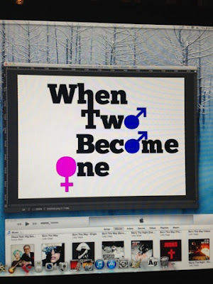
First I looked on different websites to find a suitable font. I wanted a nice bold font, so that it stood out, but nothing too fancy or complicated. This is because we need it to be easy to read and also to appeal to males, where as other fonts, such as a type of script, would be more suitable for a female aimed romantic comedy.
Once I found a font I thought was suitable, I downloaded it and then typed out our film title on a white background.
I went on to edited it so that the 'W' and 'T' were connected, as it looked more interesting that usual text and could represent how the twins are 'becoming one'.
I stuck with black text because it will be able to stand out on anything. As we would be showing this over the opening video, we need to ensure it won't become hard to see when against other colours.
I then incorporated the gender signs into the text, to make the title more interesting and to also get across the story a little (two guys after one girl). I made the male signs blue and the female sign pink, which are stereotypical colours of each gender, so that it was clear which was which.
This was my first design:

I then felt that this design gave the wrong message and looked like the film would be about two men becoming a woman, so I changed it to just the male gender signs:
Because we're going to be adding this image over the title sequence, I needed to make it transparent as well:
This is the end result:
Mia Norton


No comments:
Post a Comment