Cheetah Productions
Wednesday, 1 May 2013
G321 - Title Change
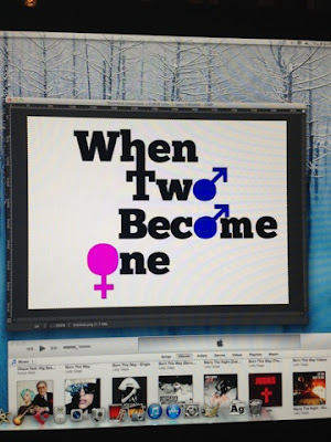
Our film was originally called "When Two Become One" but because this is the name of a Spice Girls song we were worried about copyright issues. So to fix this we changed the name to one of our original name ideas "Double Trouble".
Katie Pridige
Katie Pridige
G321 - Rough Cut 2
This is our second rough cut where we have changed the font for the title. The issue we now have is that there are copyright issues with the title of the film. So we are going to change the title to one of our other ideas in order to avoid this problem.
Katie Pridige
Monday, 22 April 2013
G321 - Rough cut 1
In our first rough cut of our film we noticed a few problems such as...
We had not included our institutional logo our company logo as we had not yet completed them (e.g. included sound), so did not want to include them yet. One of our shots did not focus meaning it looked unprofessional in comparison to the other shots within our film opening. For our next rough cut we will switch this shot for another that is suitable and keeps the continuity.
We decided the film title itself should stand out more (perhaps the font should be slightly different), this is one change we are going to make for our next cut.
By Katie Pridige and Mia Norton
Wednesday, 27 March 2013
G321 - Final shot list
Shot Description
|
Length
|
Equipment
|
Low angle, tracking shot into OTTS of Cat looking in the mirror doing her make up
|
4 seconds
|
Camera
|
Low angle in to slight tilt up looking up at Sam reading book
|
3 seconds
|
Camera
|
Close up of books on table
|
1.5 seconds
|
Camera
|
Tilt up (male gaze) of cat deciding what dress to wear
|
4 seconds
|
Camera and tripod
|
Tilt up of Sam putting on blazer
|
3 seconds
|
Camera
|
Extreme close up of jewellery
|
3 seconds
|
Camera
|
Extreme close up of hip flask
|
2 seconds
|
Camera
|
Close up of hip flask in blazer
|
2 seconds
|
Camera
|
Pan across with blur of cat still deciding what dress
|
3 seconds
|
Camera and tripod
|
Mid angle of Sam in the mirror
|
3 seconds
|
Camera
|
Close up of Cat brushing her hair
|
3 seconds
|
Camera
|
Close up of aftershaves on table
|
2 seconds
|
Camera
|
Close up of neck spraying aftershave
|
2 seconds
|
Camera
|
Close up of aftershave being put down
|
2 seconds
|
Camera
|
Over the shoulder shot of Cat looking in the mirror
|
2 seconds
|
Camera
|
High angle, tracking shot into OTSS of Cat sitting on bed texting
|
3 seconds
|
Camera
|
Long shot of twins in kitchen
|
5 seconds
|
Camera
|
Mid angle of Cat sitting at table
|
4 seconds
|
Camera
|
Mid angle of Sam entering the date and sitting on chair
|
3 seconds
|
Camera
|
Mid angle of Cat and Sam looking at menu
|
3 seconds to fade
|
Camera
|
We have made a few changes to our shot list as when we started filming we found some of the shots didn't work how we wanted them to. For example, we added in more over the shoulder shots because it made each shot flow better and made the film look more professional. We also added in some extreme close ups to highlight important elements of our film opening and engage the audience to make them expect more from the film.
Charlotte Hester
Monday, 11 March 2013
G321- Film Title Editing
I decided to play around on some editing software in order to create a nice title to use in the opening credits of our film (it could also be used on any promotional items the film would have, such as posters, and also a DVD cover).
I stuck with black text because it will be able to stand out on anything. As we would be showing this over the opening video, we need to ensure it won't become hard to see when against other colours.

I then felt that this design gave the wrong message and looked like the film would be about two men becoming a woman, so I changed it to just the male gender signs:
Mia Norton
First I looked on different websites to find a suitable font. I wanted a nice bold font, so that it stood out, but nothing too fancy or complicated. This is because we need it to be easy to read and also to appeal to males, where as other fonts, such as a type of script, would be more suitable for a female aimed romantic comedy.
Once I found a font I thought was suitable, I downloaded it and then typed out our film title on a white background.
I went on to edited it so that the 'W' and 'T' were connected, as it looked more interesting that usual text and could represent how the twins are 'becoming one'.
I stuck with black text because it will be able to stand out on anything. As we would be showing this over the opening video, we need to ensure it won't become hard to see when against other colours.
I then incorporated the gender signs into the text, to make the title more interesting and to also get across the story a little (two guys after one girl). I made the male signs blue and the female sign pink, which are stereotypical colours of each gender, so that it was clear which was which.
This was my first design:

I then felt that this design gave the wrong message and looked like the film would be about two men becoming a woman, so I changed it to just the male gender signs:
Because we're going to be adding this image over the title sequence, I needed to make it transparent as well:
This is the end result:
Mia Norton
Saturday, 9 March 2013
G321 - Day 3 - (Set and Props)
On the 3rd day of filming we had both Cat and Sam together on their date.
Before we dressed the room to look like a restaurant:
We began creating a restaurant table in front of the floral wallpaper by putting an appropriately sized table (for 2 people), putting a white cloth over the top of it and then dressing the table with cutlery and other items you would find on a restaurant table when you first arrive.
We included wine glasses and breadsticks ,because there is often a basket of bread or something to 'nibble' on before your order arrives.
The candle creates a more romantic atmosphere on their date. But after this picture was taken we changed the candles to 3 small tea light candles as they were less prominent and didn't take over the table.We also included extra cutlery to create a more realistic restaurant.
We made a menu for our restaurant. We named it Chester's Palace and inside we listed different courses and meals in a style that created a convincing menu.
We did come across the issue of lighting as it was supposed to look as though it was the evening but the lighting was too bright and natural. To fix this we closed all the blinds and covered any windows that did not have a blind to close. This meant we had complete control over the lighting and the mood we wished to create.
Katie Pridige
Subscribe to:
Comments (Atom)


